More than any crisis in recent times, the COVID-19 outbreak is driven by data. You see virus statistics everywhere, sliced and diced dozens of ways on interactive maps, graphs and tables.
Numbers feel like immutable facts, but they’re just as susceptible as words to oversimplification, hyperbole and propaganda. We’ve become newly acquainted with our calculators at Factal, and here are a few things we’ve learned covering the arc of the virus around the world over the last few months:
Get as close to the data source as possible
The closer you get to the original source, the higher the likelihood the data is correct and up-to-date. However, this is easier said than done – numbers are scattered across thousands of global health and government sources.
Fortunately there are some very good aggregators. WHO is the official roll-up of global COVID-19 case data, but Johns Hopkins has been the clear winner in combining WHO data with local sources at a fairly rapid update rate (its data sources are listed here.)
At the US level, the CDC has been lagging way behind with state-level data – even failing to update on weekends. So the COVID Tracking Project has stepped into the void with a solid round-up by state, and the NY Times has the best county-by-county aggregation of case data. Both of these data sets are available for download.
In the UK, Public Health England is updating cases on at least a daily rhythm.
Case totals can be misleading
Coronavirus cases are the easiest metric to understand, and that’s why they’ve found a permanent home on cable TV news screens. But taken by themselves, they can provide an incomplete and sometimes biased view of what’s happening.
For starters, some countries have different methodologies for counting positive cases. Brazil and Russia, for example, are believed to be undercounting by not considering pneumonia cases as likely COVID-19 infections. China has been accused of not counting asymptomatic cases.
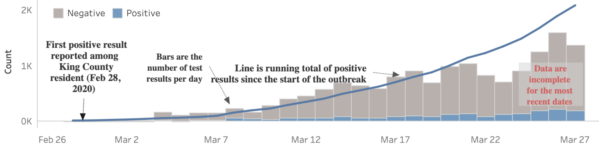
But the biggest variable is testing: the more tests you conduct, the more positive cases you find. Since testing availability varies dramatically by location, it’s hard to get a true relative sense of which areas are harder hit – even when you break it down per capita. This graph by King County, Washington – where tests are still in short supply – does a good job of illustrating both daily testing volume (grey bar) and positive cases (blue bar):
The case fatality rate (CFR) is also a function of testing. If early testing is limited and focused on higher-risk patients, the rate is higher. As we’ve seen in Germany, widespread testing leads to a much lower mortality rate.
As the availability of testing improves, then the data improves. For example, New York cases surged as the state ramped up testing – and continues to surge. Testing velocity is less of a factor now, and it’s clear the state has a large-scale outbreak on its hands, especially in population-dense New York City.
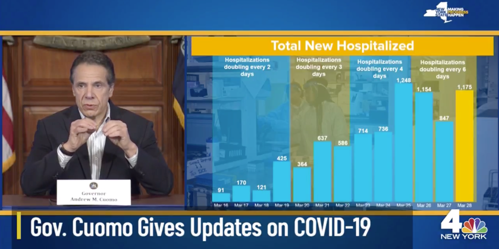
Hospitalization rates are a key metric to watch. New York has been on the leading edge of sharing this data (above), which is not widely available. Less driven by testing variation, hospitalization gets to the heart of the matter: “[It] directly reflects the strain on the medical system,” says FiveThirtyEight’s Nate Silver. Other data points like current hospital capacity, ICU patients, infections among first responders and medical staff, PPE availability and 911 call volume are good indicators, too. Like we’ve seen in Lombardi, Italy, an overwhelmed medical system accelerates and prolongs the outbreak.
We’re running on a delay on different clocks
Humans are impatient by nature, especially after we’ve been quarantined for weeks on end. But it’s worth remembering that the data we’re seeing is running on a two to six-week delay. It’s like we’re watching a news broadcast from a distant planet in another galaxy.
It takes time for an individual to become symptomatic enough (0-14+ days) – or realize they’ve had close contact with a positive case – to want to get tested. Then add the time it takes to locate and take a test (0-10+ days) and the lab to process the test (1-7 days), and you’re looking at two weeks or more. (These times will improve with greater testing availability and faster test processing).
By extension, the benefits of social distancing are on delay, as well. While it varies by how significant and how early these measures were implemented, you can expect several weeks to begin to see a sustained impact in the data.
Meanwhile each community is running on its own clock based on when the first cases were discovered. “The top of the curve will occur at different times at different places,” explains New York Governor Andrew Cuomo, who called it a “rolling apex” – not just for different states, but cities and counties, too.
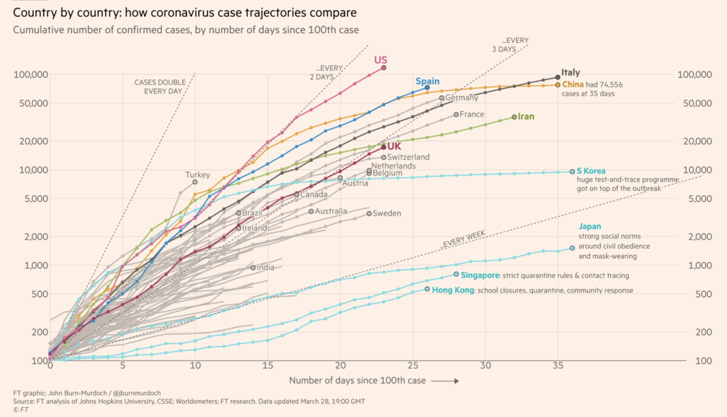
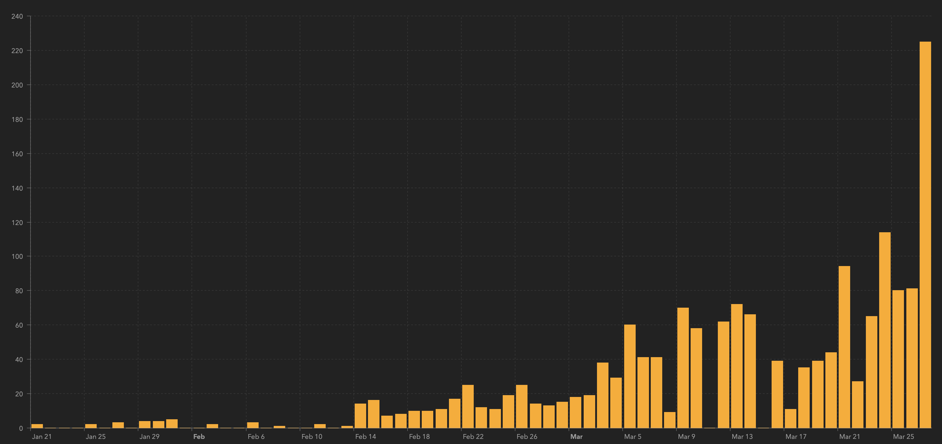
When you normalize the timing, you get interesting data visualizations like the one above. This graph time-shifts known cases on a cumulative basis to the same starting point so you can compare trajectories side-by-side. Again, testing velocity plays a role, but normalizes over time. And as you’ll see below, not all curves are created equal.
All infection curves are different
You can’t blame people for holding out hope that flattening infection curves in South Korea, Singapore and China will lead to the same recoveries in their own communities. But the reality is more complicated. Each country’s response, health care system, culture, laws, politics and media are different.
Let’s take South Korea, for example. A veteran of the MERS outbreak in 2015, the country began free testing in large volumes right out of the gate. Once a case was identified, health officials tracked down contacts through surveillance cameras, license plates, cellphones and credit card transactions. Lower-risk and asymptomatic patients were sent to converted dormitories provided by private companies, reserving hospital beds for more serious and high-risk patients. (A country with a single-payer health-care system, South Korea has four times as many hospital beds per capita as the US.) This also reduced at-home quarantining and slowed infections among family members.
This stands in stark contrast to the US and UK on several fronts, and we can’t rewind the clock to take advantage of South Korea’s response. However, comparing curves between similar countries, cities and circumstances can be powerful. Italy, for example, has been a great advance-warning curve for European countries and the US to expedite their efforts to prepare for the worst.
Beware of the double wave
“Flatten the curve” has been a powerful visual metaphor to encourage people to distance themselves from others. But it also gives the impression that once the curve is in decline – when the apex has been reached – the worst is over. That may not be the case.
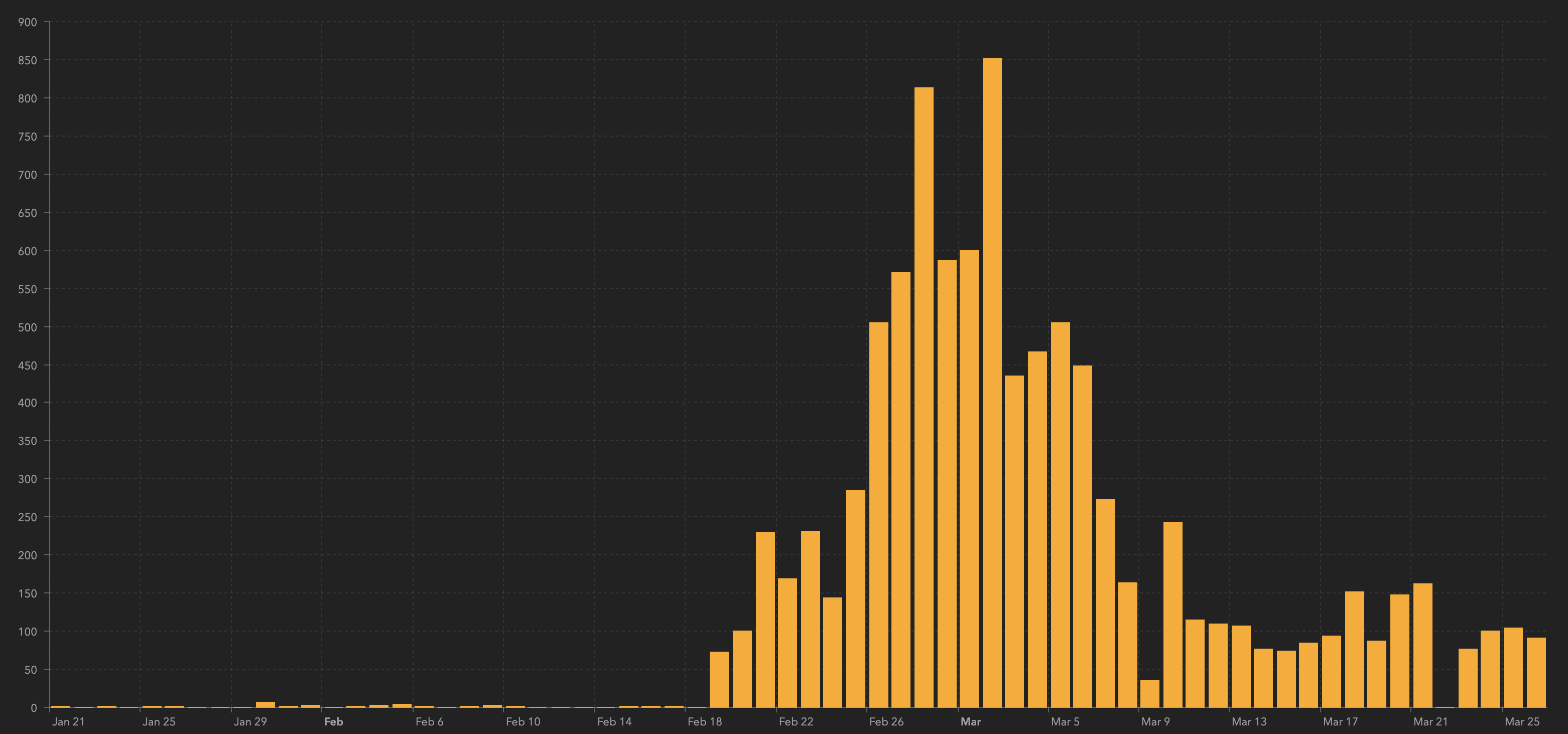
After the appearance of gaining early control, Japan’s daily cases are climbing again (below). The early flattening may have created “hygiene fatigue” and a false sense of security, especially in Tokyo.
The city of Wuhan, China, is beginning to relax some of its social distancing restrictions, and researchers warn that it may be premature. “That could lead to an earlier secondary peak in cases,” said researcher Kiesha Prem. “If they relax the restrictions gradually, this is likely to both delay and flatten the peak.”
There are lots of variables at play. There’s the political pressure to reopen businesses, resume travel and restore economies. There’s hygiene fatigue and cabin fever. There’s the risk that patients who tested positive – and then get a negative test after a recovery period – reconnect with others prematurely. There’s the danger that recovering cities and countries are reinfected by visitors from ongoing outbreaks (South Korea has enacted a mandatory quarantine for all visitors). And there’s the big unknown of COVID-19’s susceptibility to summer – will a second wave come roaring back this fall?
These are all good reminders that while we’re awash in numbers, there are still many questions to be answered. However, directionally the data is clear: COVID-19 poses a significant risk, and aggressive testing and social distancing are the best measures to help slow the spread.
(Cory Bergman is co-founder and VP of product/news at Factal, an enterprise breaking news platform that makes it easier for large organizations to coordinate and respond to crisis events in real time. Companies can gain immediate access for 30 days at no cost. Factal is free for NGOs.)